
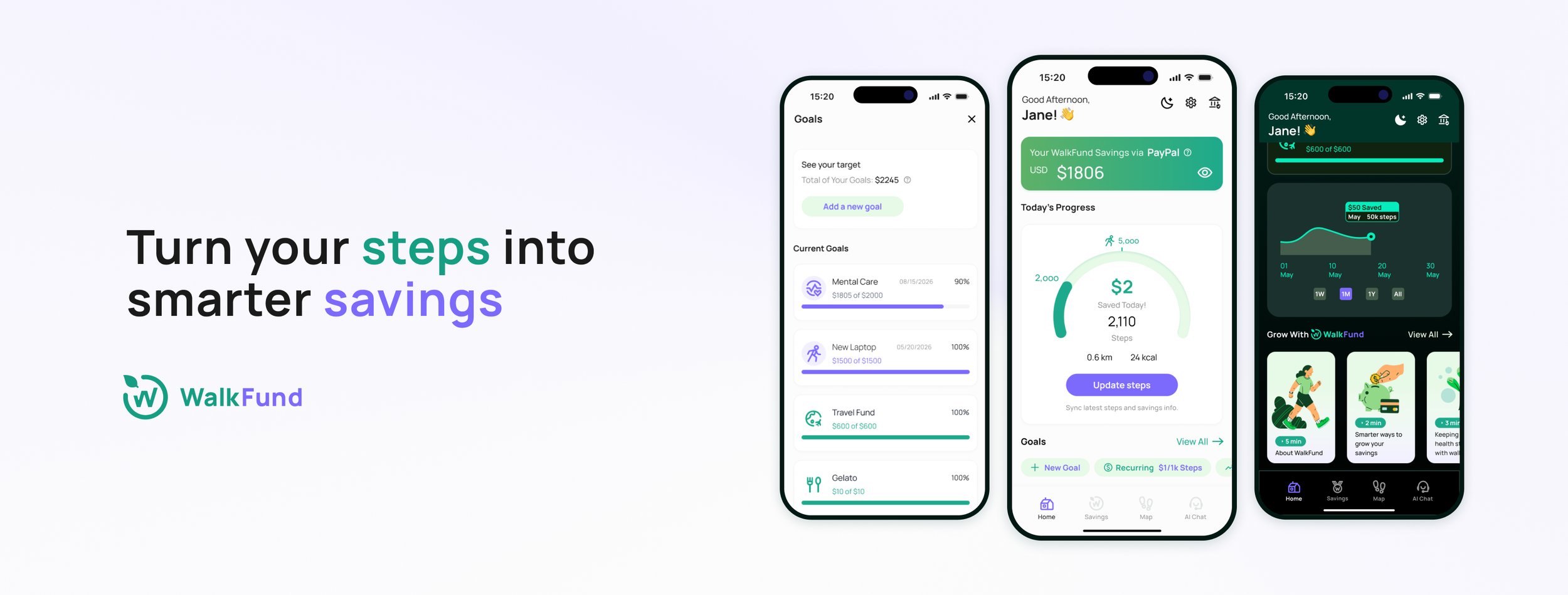
Turn Your Steps into Smarter Savings
WalkFund is an end-to-end concept helps urban young adults build simple, consistent financial habits.

My Role
Product Designer, Brand Designer
Timeline
12 Weeks, 2025
Focus
Product Design, UX Research, Brand and Visual Design
The Context
What if the steps they already take could quietly build their savings?
This is where WalkFund begins.
In walkable cities like New York, young adults often prefer to move through their day on foot, heading toward work, home, or a moment of quiet. But saving money still feels heavy, abstract, and hard to maintain.
The challenge is finding a way to make saving feel as effortless as the walking they already do.
Core Experiences
Step-Triggered Savings with Financial Safety
WalkFund never stores money. Savings run through Apple Pay, PayPal, or Cash App.
When a step goal is met (e.g., 1,000 steps = $1), a small transfer will be triggered, keeping all savings secure within trusted accounts.
Start at Small, Achievable Savings Goals
WalkFund makes daily steps a small push toward their savings goals.
4 steps to set your goal, helping users build a saving habit without pressure or financial overwhelm.
Reach Your Amount and Your Goal
WalkFund celebrates users when they reach their target amount.
The system helps scheduled goals on track with automated recommendations to help users follow through.
Redeem a Nearby Reward
WalkFund offers local rewards that encourage users to walk and explore new neighborhoods.
Community collaboration with partner shops, turning city walks into small moments of delight and neighbor connection.
Ask WAI, Your Smart Saving Companion
WAI helps users make saving and lifestyle decisions confident and transparent.
With simple, trustworthy guidance, WAI acts as a light financial and wellness advisor.
Design Journey
Why This Project
Background
New Yorkers average 6,000–10,000 steps a day, far above the U.S. average of 5,000. Young adults continue to struggle financially, over half can’t save consistently, and nearly one in four Americans (28%) have savings below $1,000 in savings (Bankrate, 2023; Forbes Advisor, 2024).
And Why?
My friends and I struggled to save consistently, even with reward apps like Sweatcoin. The bonuses felt too small, more like gamified fitness points than real financial progress. This led to a simple question:
Could everyday walking contribute to saving in a clearer, more impactful way?
Research
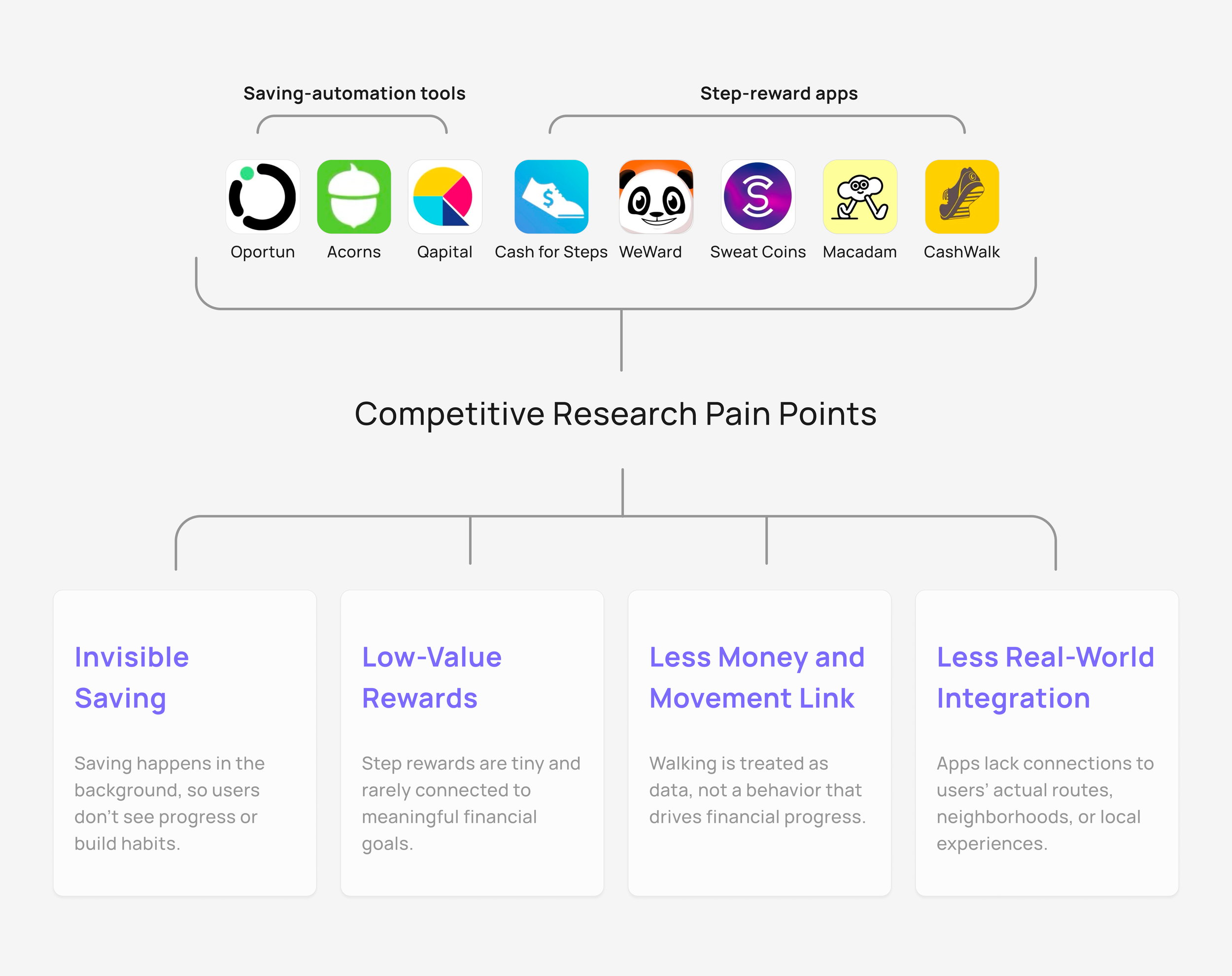
Competitive Analysis
We examined 8 in-all saving-automation tools and step-reward apps across fintech and wellness. Most fall into two patterns:
Automation tools make saving intangible, running quietly behind rules and dashboards.
Step-reward apps offer tiny, generic perks with little connection to real financial goals.
This leaves a clear gap for a walking-first approach that makes saving visible, meaningful, and lightweight for life.
Interviews
Interviews with 6 young adults (22-35) in New York. They walk to relax, commute, or explore, and their habits depend on mood, environment, and daily routines.
They said that saving is difficult to maintain. They want financial stability, but current tools and rewards don’t motivate them and feel disconnected from their real lives.
We used an Affinity Map to group 5 shared buckets.
Walking Motivation
Behavior Patterns
Challenges
Trust and Safety Concerns
Reward Preferences
Synthesis
Key Insights
Based on competitive research and interviews, we discovered deeper behavioral patterns behind how young adults walk, save, and stay motivated. While walking already carries emotional and lifestyle meaning, saving often feels invisible, abstract, or difficult to sustain.
Synthesizing both research streams, we identified five key insights:
Opportunity Space
Then, we can uncovered 5 opportunities of our product:
Make saving feel safe, transparent, and low-pressure
Make saving emotionally visible and engaging
Connect walking behaviors to financial outcomes
Put real-life city context into rewards
Lower barriers to starting and maintaining saving habits
Target Users
To focus our opportunity spaces into a clear product direction, we narrowed WalkFund’s audience by refining and mapping interview responses.
This lifestyle-financial value spectrum revealed distinct behavior patterns that shaped WalkFund’s core archetypes.
Here are two dominant groups:
Life-driven who seek meaningful walking moments
Finance-driven who prioritize efficiency and tangible results.
These formed our two personas.
Business Strategy
Why Walking and Saving?
Walking is a daily, low-effort habit tied to relaxation, discovery, and routine. Saving, however, often feels abstract and hard to sustain.
Behavioral Economics shows that when financial goals are reframed into small, familiar actions, people feel more motivated and confident. (Berkeley Economic Review).
Likewise, research on the Automatic Savings suggests that micro-contributions reduce friction and boost long-term saving behavior (Hershfield, Shu & Benartzi, 2018).
WalkFund brings these theories together by converting daily steps into automatic, visible micro-savings.
If you walk 1,000 steps, then $1 is saved.
Simple, tangible, and emotionally rewarding.
How These Tie Into Strategy
Taken business goals, research insights, and user benefits together to define WalkFund’s strategic priorities:
❇️ ❇️ ❇️ Trust, build trust as the foundation
❇️ ❇️ Motivation, make saving feel motivating and achievable
❇️ Lifestyle Value, deepen daily engagement
These priorities guide the core system design and determine which features matter most for users.
System Map
Building Trust into the System
From our interviews, business strategy, and HMWs, Trust must be the foundation of WalkFund’s experience:
Walking triggers micro-savings, trusted payment flows keep users confident, and rewards keep them motivated.
And one brand strategy principle:
WalkFund never holds user funds, it only help users reach their goals.
Design Concept
Ideation to Final MVP Directions
Then, we generated 50+ feature ideas and narrowed them through structured filters.
To ensure our MVP solved the core user problems, we grouped all ideas into four strategic directions:
Micro-goals Setting — Motivation
Nearby Rewards — Motivation
Progress Visualization — Lifestyle Value
AI Savings Assistant (Personalized Help) — Lifestyle Value
Directions to Feature Set
With the strategic directions clarified, we defined four essential interactions that form the MVP flow:
Set a goal
Complete a goal
Redeem a reward
Chat with AI Assistant
Design Exploration
We sketched quickly to visualize how WalkFund could unify trust, micro-saving, and lifestyle motivation. These explorations helped shape the core MVP features.
User Journey
Then, I mapped journey to illustrate how WalkFund’s core features work together and why the MVP set effectively supports both finance-driven and lifestyle-driven users.
Initial Wireframes
I led the interaction design, starting with lo-fi prototypes to quickly outline flows.
1. Set a Goal
Users create small saving targets tied to walking behavior and see the process data clearly.
2. Complete a Goal
A simplified flow reinforces achievement and suggestion.
3. Redeem a Reward
Users can find nearby coupons, closing the motivation loop.
4. Chat with AI Assistant
AI guidance supports users during onboarding and any finance/health-walking questions.
Tests and Iterations
Tested 18 participants across in-person with Figma and remote with Useberry
(Round 1: n=9, Round 2: n=9, Final Return: n=3).
Users can understand WalkFund’s core idea: Walk to Save, with 80% accurately re-describing it.
But in Round 1, nearly half reported the process wasn’t intuitive and experienced slowdowns during key tasks.
Challenge 1: Hidden and Hard-to-Find “Add a Goal” Entry
Round 1 testing (n=9) revealed that users struggled to begin one of the app’s core actions: 6/9 users couldn’t find Add a Goal (buried too deep).
Challenge 3: Non-intuitive goal-setting flow
55% of users (Round 1, n=9) rated the original goal-setting flow confusing or unintuitive, citing friction and unclear steps.
Change: Moved Add a Goal to homepage; Added a second entry in Savings; Surfaced balance earlier
Result:
Find the “Add a Goal” button improved (Avg): 1m14s (Round 1) → 60s (Round 2) → 15s (Final Return).
Round 2 users (n=9) and Final Return (n=3) described the interface as clearer and aligned with expectations.
Change: Removed Digital Coins → focused on walk-to-save ; Simplified naming + structure
Result:
Round 2: Users described the interface as clearer, more direct, and aligned with expectations.
No further conceptual confusion reported
Change: Streamlined the flow by merging scattered settings into one simplified flow and reduce cognitive load.
Result:
Task time 64%↓(Avg): 62s (Round 1) → 12s (Round 2);
55% (Round 1) confusion → 100% ease (Round 2, 6/9 Easy ↑ and 3/9 Very Easy ↑↑)
Challenge 4: Overloaded completion flow
Users felt the completion flow was too busy and contained too much information.
Change: Simplified the flow, repositioned suggestions, and replaced Smart Planner with a clearer visual summary.
Result:
Round 2, 4/9 users reported higher motivation and clarity,
Completion moment felt rewarding (“earned the click”)
Clearer view of remaining goals → stronger engagement
Challenge 2: Clarifying Savings vs. Digital Coins
From the Round 1, 6/9 users were confused by “Savings vs. Digital Coins (original ideas for the rewards),” which increased cognitive load.
Hi-Fi Mockups
Brand and Icon Design
Outcomes
Impact
Usability test with 18 participants (Round 1 n=9, Round 2 n=6, Final Return n=3).
Outcome Highlights:
Core Concept Clarity ↑: 80% → 100% users clearly explained “walk → save.”
44% → 0% friction reduction for discovering the Add a Goal entry point (after IA improvements).Task Efficiency ↑ Add Goal time 1m14s → 60s → 15s (-79%).
Completion flow became more motivating, with 50%+ mentioning increased motivation from visual cues (progress view + confetti).
Navigation clarity improved → 78% of participants said they could navigate without instructions.
Overall Success ↑ Late-stage tests reached 100% task completion across all MVP flows.
Users understand WalkFund instantly
Clearer IA, faster task time, higher motivation
Strong validation for MVP direction