

WtC Rental System Improvement
An end-to-end B2B service redesign that streamlined event rental workflows and aligned internal operations.
Role
Solo Product Designer
Team
Web Designer, Marketing Team (WtC)
Timeline
10/2025 – 12/2025
Context
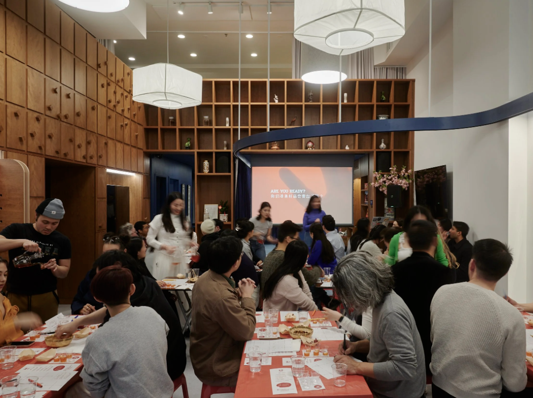
Welcome to Chinatown (WtC) is a community-based nonprofit in Manhattan Chinatown. They host a wide range of events within a modular event space called The Hub.
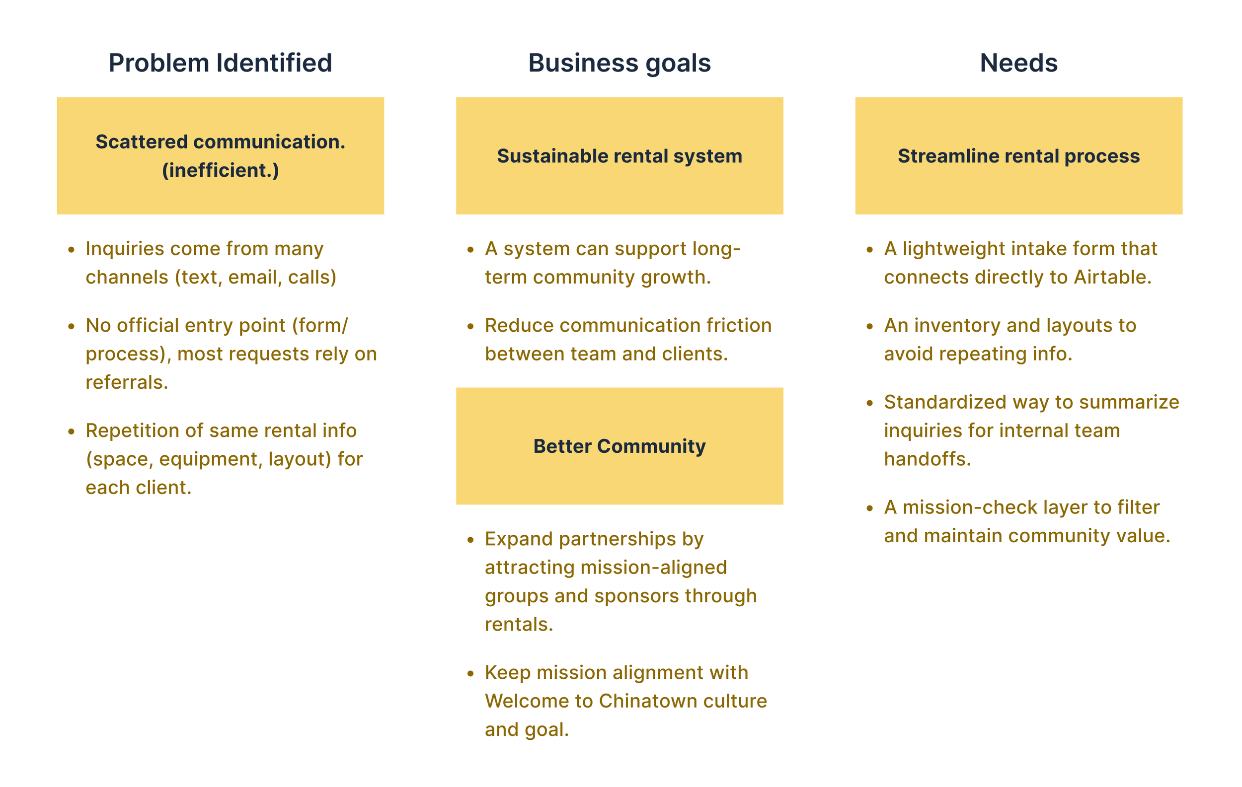
As rentals grew, details lived across emails, texts, and Airtable, which have created repeated questions, slower decisions, and heavy coordination for staff.

Problem Framing
Clarifying the stakeholders’ goals
To ground the challenge, I run a 30-minute light talks with stakeholders to understand their current business goals and constraints.
Stakeholders’ talks revealed that:
Rental information was fragmented, making it hard to run a consistent, mission-aligned rental process.

How might we make rentals easy to understand and act on, while keeping WtC’s mission as a clear filter?
Research
Competitive Research
To understand how similar nonprofit rental platforms structure their rental experience, I reviewed a small set of comparable spaces and leasing pages.
Key insights:
One clear rental entry
Set pricing, rules, availability upfront
Use mission as a filtering strength
Show space and setups visually
What this informed:
Rental pages that surface fit, pricing, and visuals early reduce coordination before contact.
Deep Talk with the Stakeholder
Then, I met with Jeff, WtC’s Event Manager, who handles all rental communication.
In a 1.5-hour conversation, we walked through his end-to-end workflow to understand what works well and where friction occurs (Comparative Approach).
Client Interview Insights
Clients’ experience can help us understand important pain points. Three deep talks with previous collaborators with WtC.
System Synthesis
Current Journey & Opportunity Signals
To synthesize insights from stakeholders and clients, I mapped the current rental journey and marked repeated friction points across before / during / after the event.
Systemic Breakdowns
Why the current rental system repeatedly creates friction
While individual issues surfaced at different stages, the breakdowns stem from a few systemic patterns across the entire rental journey.
Design Direction
These breakdowns revealed one core need:
Centralize info early → move decisions upstream → capture outcomes as reusable system memory.
Solution
A 5-Step Rental System Redesign
So, I proposed a 5-step rental system that front-loads clarity, reduces staff follow-ups, and creates a simple post-event learning loop. Here are the 5 steps:
System Implementation Overview (Internal + Client Flow)
Illustrates how the 5-step system works end-to-end across roles.
Design Scope
Website as the Rental Entry Point
After alignment with stakeholders, my scope focused on the rental entry experience, which was primarily implemented through a redesigned website to shape understanding before intake, walkthrough, or contracts.
Key Design Decisions
Challenge 1: Hub vs. Rentals were mixed
Discussed with stakeholders and feedback from clients, we felt that the Rental info was buried inside general Hub pages, causing confusion and extra questions.
Design Response:
I split Hub vs. Rentals into two clear paths within a new IA and moved space/rental details into a dedicated Rentals entry to reduce overload and misroutes.
Challenge 2: Rental details were unclear upfront
Adjusted based on feedback, pricing, usage rules, and space references were tucked behind collapsible sections, making rentals hard to grasp quickly.
Design Response:
I surfaced pricing/usage details upfront and added visual inventory (photos, layouts, real event examples), so collaborators could decide with less back-and-forth.
Challenge 3: Planning signals were missing
Based on the test, collaborators couldn’t easily couldn’t tell availability or how far ahead to plan, creating early uncertainty.
Design Response:
I added planning cues, especially a Google Calendar availability view, and clarified how rentals differ from coworking..
Final Delivery
Business Impact
Early feedback shows rentals are easier to understand and fewer planning questions.
What we’re seeing so far
1. Clearer rental positioning
Stakeholders said Hub vs. Rentals is easier to explain. In usability testing(n=5), 4 out of 5 participants rated it “very clear.”
2.Less back-and-forth
Key details are now visible upfront, reducing missing information and follow-up emails.
3.More confident decisions through visuals
Collabrators said photos + real event examples helped them choose a setup earlier.
Preparing to ship
The Rentals pages are in the final shipping phase. Core IA and key flows have been reviewed with stakeholders and validated in usability testing.

Team Impact
This project reinforced the value of early stakeholder alignment. Talking with the team and listening closely helped surface real operational constraints, so the system addressed real needs and led to more grounded solutions.